RESPONSIBILITIES
PRODUCT DESIGN
PRODUCT DESIGN
UI/UX DESIGN
UI/UX DESIGN
BRAND DESIGN
BRAND DESIGN
CLIENT
WITMINA - SAAS
DELIVERABLES
MOBILE APP, VIDEO GAME
RESPONSIBILITIES
PRODUCT DESIGN
UI/UX DESIGN
BRAND DESIGN
CLIENT
WITMINA - SAAS
DELIVERABLES
MOBILE APP, VIDEO GAME
OUTCOME
Working on Witmina was a great opportunity for me to design a brain training experience that feels fun, structured, and easy to follow. I focused on clear onboarding, simple navigation, and a smooth flow so users could start playing quickly and always know what to do next.
I had the freedom to use proven design patterns, which helped me make the app cleaner and the progress easier to understand. The final experience has short sessions, clear improvement, and friendly messages that help users build a habit and come back often.
INTRO
INTRO
Witmina is a brain-training platform that helps users build core cognitive skills through structured sessions, interactive games, and measurable progress. I designed the end-to-end training experience and game interactions, emphasizing clarity, motivation, and long-term habit formation.
Witmina is a brain-training platform that helps users build core cognitive skills through structured sessions, interactive games, and measurable progress. I designed the end-to-end training experience and game interactions, emphasizing clarity, motivation, and long-term habit formation.


THE GOAL
My goal was to create an experience that feels approachable while remaining credible and effective. Users needed to start training quickly, understand which skills they were developing, and clearly see progress over time. Every screen was designed to answer two questions: what happens next and why it matters.

CHALLANGES
While Witmina had strong training content, engagement dropped quickly. Sessions could feel repetitive; progression wasn't always intuitive; and game recommendations lacked context. Progress relied too heavily on raw numbers, making improvement hard to interpret and reducing motivation to continue.
SOLUTIONS
I redesigned the experience to support consistency and long-term engagement. I streamlined onboarding and navigation so users can begin training immediately and move through sessions without friction. I refined the session structure to introduce greater variety, provide clearer feedback, and ensure smoother difficulty progression. I also reframed progress into clear, readable insights that explain skill development and reinforce why each game is recommended, helping users stay confident and committed.

ITERATION
Through ongoing feedback and testing, I reduced the time to first game, refined navigation patterns, and adjusted progress views to feel more encouraging and human. Difficulty progression was rebalanced so simpler activities come first, with complexity increasing gradually to build confidence and sustain momentum.
UNDERSTANDING THE USERS
Witmina serves students, professionals, and adults focused on mental fitness. Despite different goals, users shared common needs: fast onboarding, minimal cognitive load, and easy-to-understand feedback. Research and competitor analysis showed that users disengage when training feels repetitive or unclear, so I designed sessions to be short, varied, and progressively challenging within a daily routine.

USER FLOW
I defined and refined five core user flows: onboarding, starting a session, selecting games, reviewing progress, and managing settings. These flows were iterated collaboratively to prioritize speed, clarity, and flexibility, ensuring users can move forward confidently while still adjusting goals or navigating elsewhere at any time.

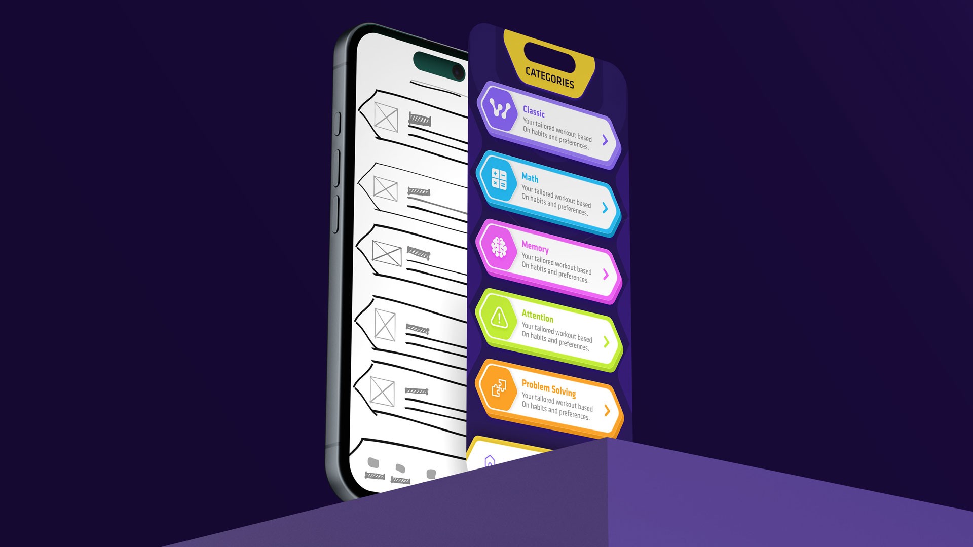
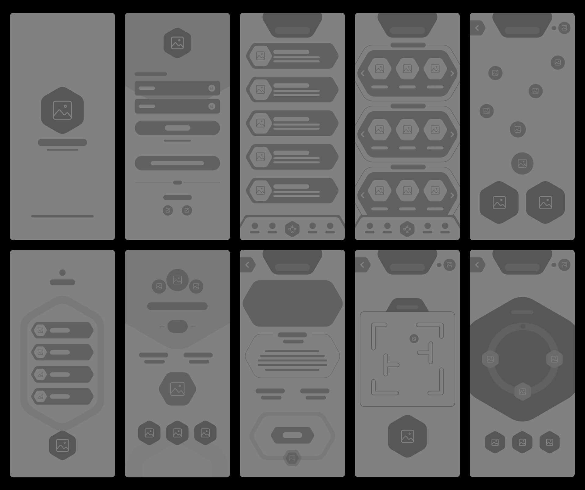
LOW-FIDELITY WIREFRAMES
Low-fidelity wireframes mapped the full journey from onboarding to long-term progress. This included goal and session setup; a home dashboard with daily progress and recommendations; a categorized game library; focused session screens with clear instructions; quick post-game feedback; a progress dashboard showing trends and streaks; and profile settings for reminders and preferences.
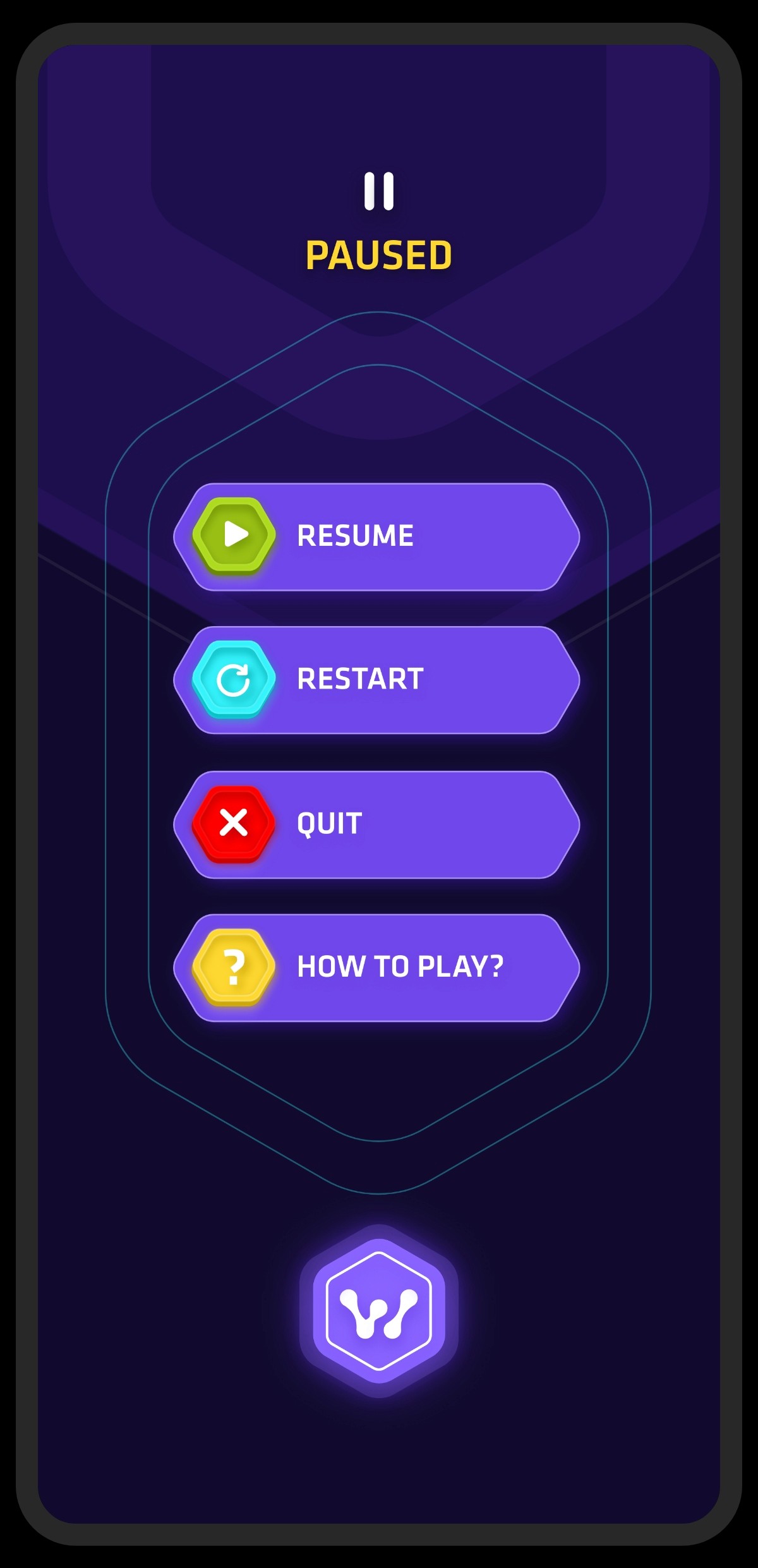
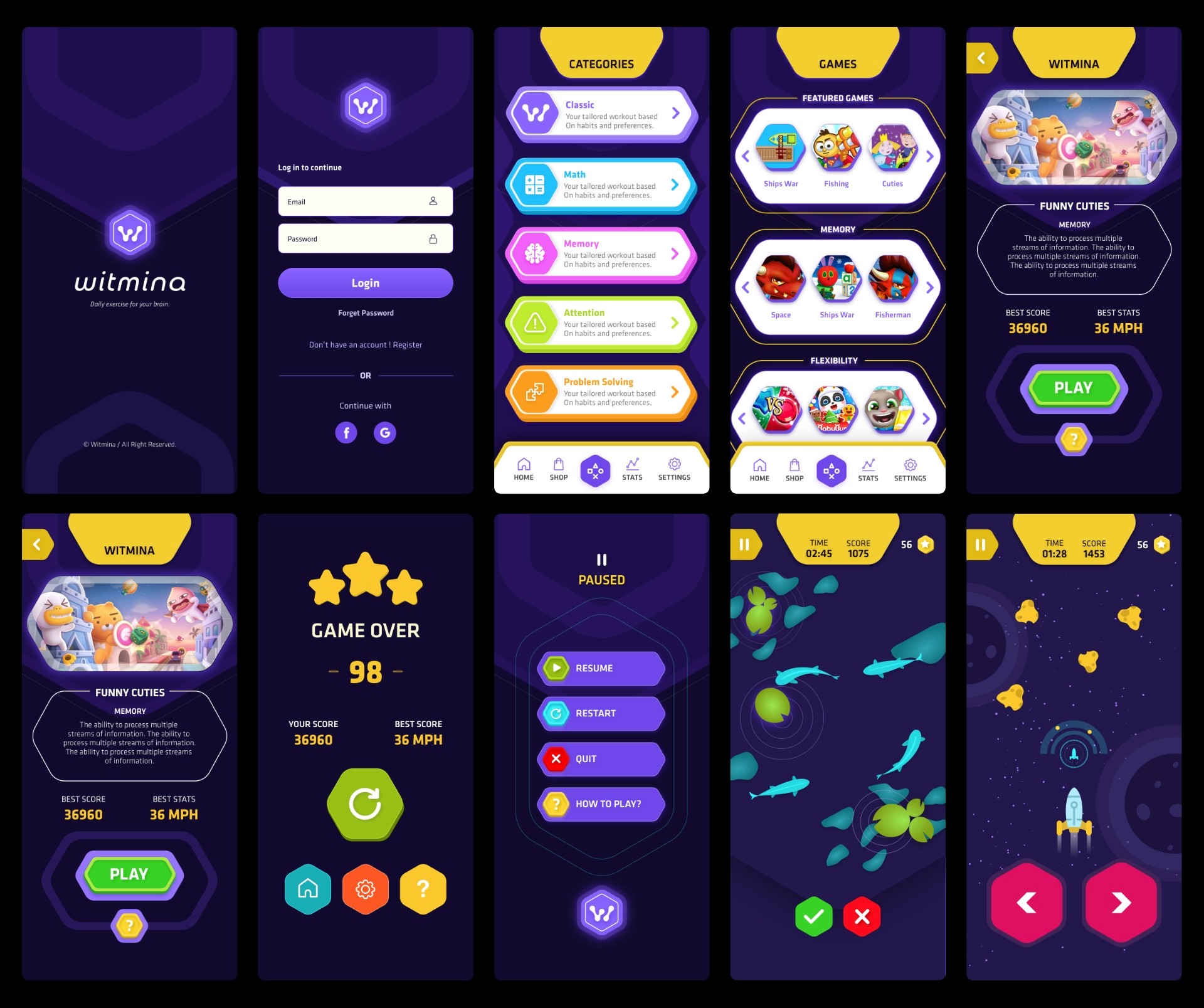
HI-FIDELITY WIREFRAMES
High-fidelity wireframes translated the system into final visuals and components. These included branded onboarding, a dashboard with recommendations and progress indicators, category navigation across all game types, polished session screens with immediate feedback, results summaries, and a clean progress dashboard with charts and streaks, supported by refined profile and settings screens.
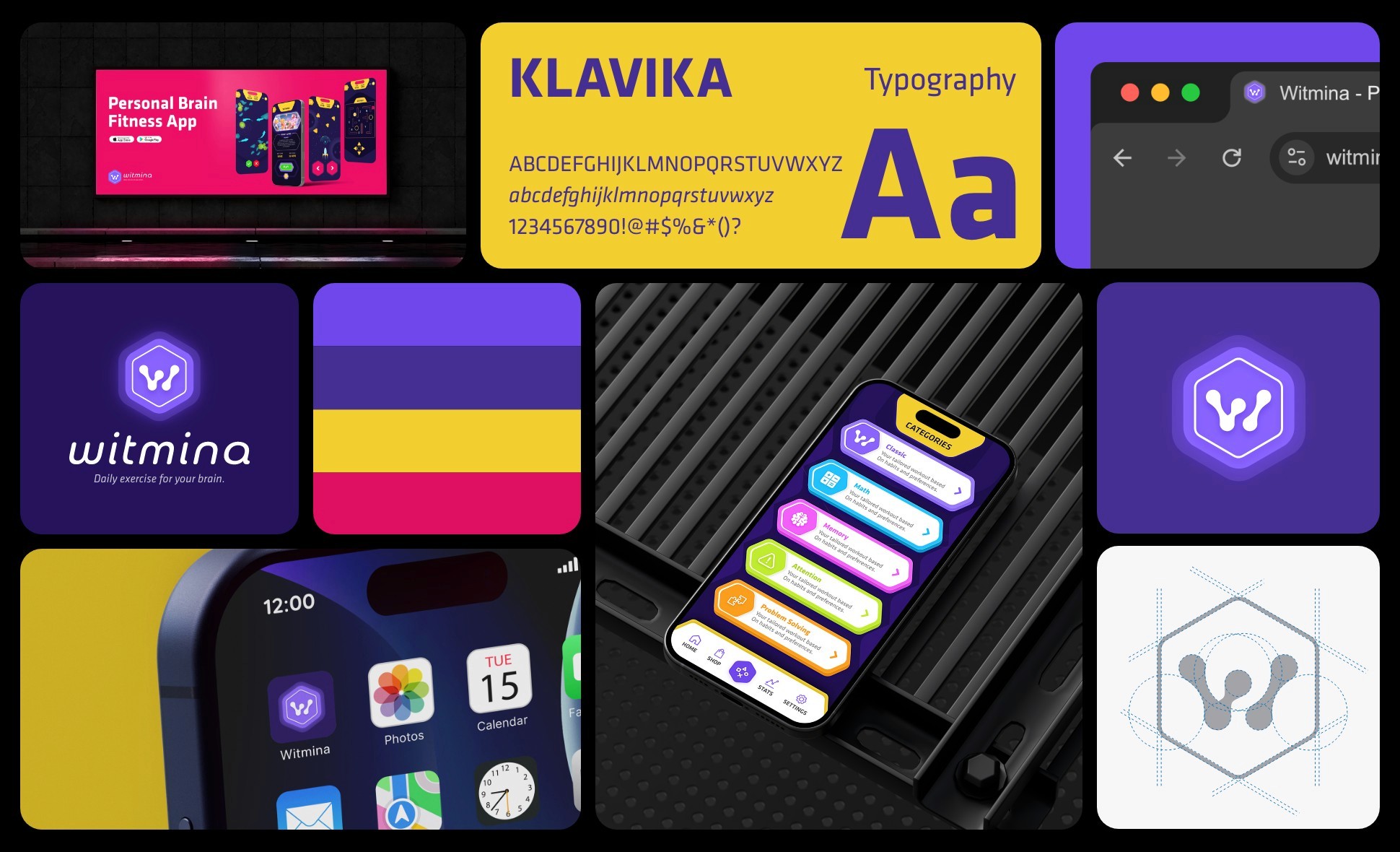
BRAND & UI STYLES
I designed the brand and UI to feel friendly, modern, and focused. Clean typography, generous white space, and rounded components keep the experience approachable without feeling casual. A neutral base with a strong primary accent highlights key actions, while soft supporting colours distinguish training categories. Progress is communicated through lightweight visuals such as bars, streaks, and simple charts, reinforced by subtle microfeedback that supports habit formation.