RESPONSIBILITIES
PRODUCT DESIGN
PRODUCT DESIGN
GRAPHIC DESIGN
GRAPHIC DESIGN
BRAND DESIGN
BRAND DESIGN
CLIENT
STARTUP
DELIVERABLES
MOBILE APP
RESPONSIBILITIES
PRODUCT DESIGN
GRAPHIC DESIGN
BRAND DESIGN
CLIENT
STARTUP
DELIVERABLES
MOBILE APP
OUTCOME
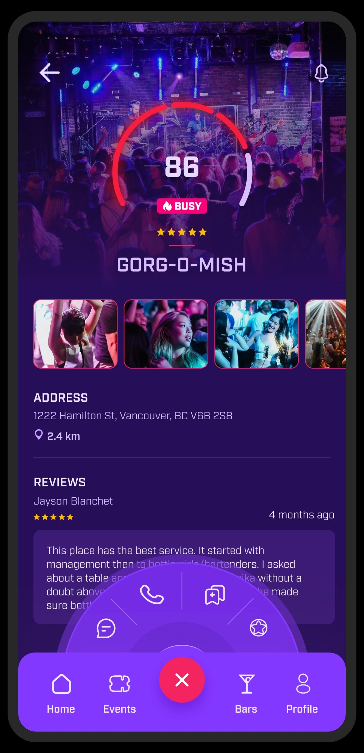
By simplifying navigation, introducing a new magic menu, and optimizing the footer to reclaim valuable screen space, I improved usability and reduced friction across key flows. These changes made it easier for users to discover events, navigate the app confidently, and complete actions quickly, resulting in a more engaging, streamlined nightlife experience.
OUTCOME
By simplifying navigation, introducing a new magic menu, and optimizing the footer to reclaim valuable screen space, I improved usability and reduced friction across key flows. These changes made it easier for users to discover events, navigate the app confidently, and complete actions quickly, resulting in a more engaging, streamlined nightlife experience.
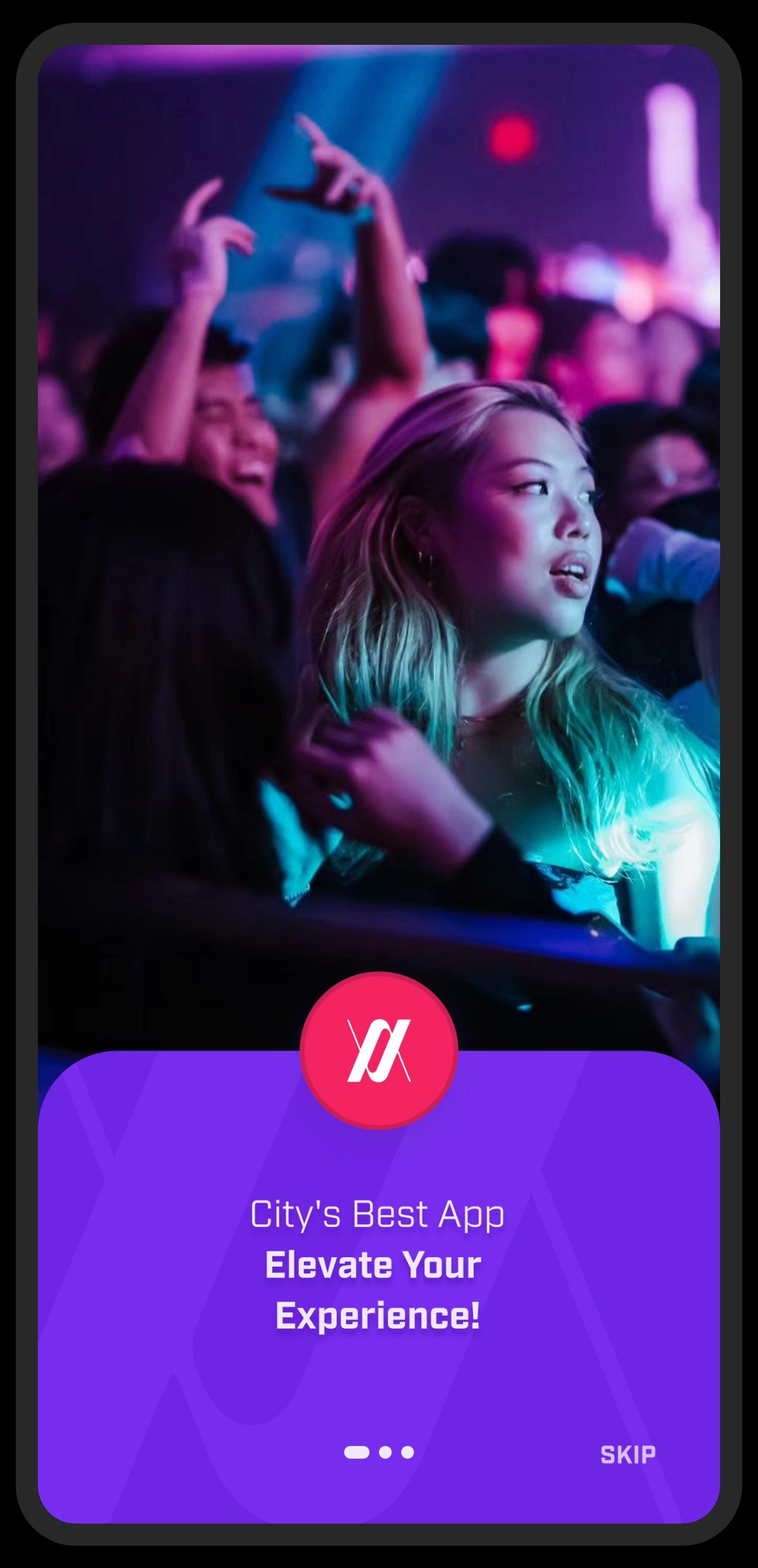
INTRO
INTRO
Vannify is a nightlife companion app that helps people discover the best events in town, share their night in real time, book guest lists and tickets, and connect with like-minded people. I focused on improving the mobile app experience, with a focus on user retention, navigation clarity, and more effective use of existing features.
Vannify is a nightlife companion app that helps people discover the best events in town, share their night in real time, book guest lists and tickets, and connect with like-minded people. I focused on improving the mobile app experience, with a focus on user retention, navigation clarity, and more effective use of existing features.


CHALLANGES
Users struggled to find relevant bars and events in Vancouver and had no clear way to track or manage plans in one place. Social interaction around events was limited, and the ticket and guest list process felt fragmented. These issues created friction and made it difficult for users to return to the app regularly.
ASSUMPTIONS MAPPING
To evaluate opportunities and risks from multiple perspectives, I facilitated an assumptions mapping exercise with stakeholders. This structured session helped surface unknowns, align priorities, and clarify which ideas needed validation. It also gave me deeper insight into stakeholder goals and constraints, allowing the UX direction to move forward with greater confidence.

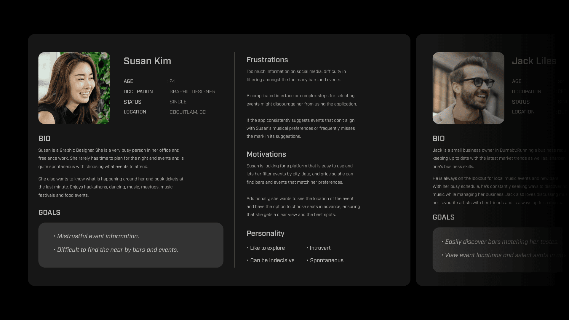
USER PERSONA
I conducted research to understand user demographics, behaviours, and frustrations. Based on these insights, I created a primary user persona representing typical nightlife-focused users, guiding decisions on navigation, feature prioritization, and social interactions.
USER PERSONA
I conducted research to understand user demographics, behaviours, and frustrations. Based on these insights, I created a primary user persona representing typical nightlife-focused users, guiding decisions on navigation, feature prioritization, and social interactions.
USER FLOW
Vannify was designed as a companion to an existing web platform, so efficient and intuitive user flows were critical. I focused on keeping core actions fast and familiar while supporting future expansion. Although the MVP was intentionally streamlined, the flows were designed to scale as new features were introduced.

LOW-FIDELITY WIREFRAMES
Because development began shortly after I joined the project, speed and alignment were essential. I created low-fidelity wireframes early to establish structure and direction while allowing design and development to move in parallel. This approach supported rapid iteration and early discussions around usability, layout, and feature placement.

HI-FIDELITY WIREFRAMES
Once core task flows were defined, I translated the wireframes into high-fidelity designs and an interactive prototype. This allowed us to validate key interactions through user testing and refine the experience before final implementation.
HI-FIDELITY WIREFRAMES
Once core task flows were defined, I translated the wireframes into high-fidelity designs and an interactive prototype. This allowed us to validate key interactions through user testing and refine the experience before final implementation.

BRAND & UI STYLES
I developed the design language starting with the main screen and refined it through multiple user iterations. The final UI balances strong visual clarity with ease of use, creating an interface that feels energetic, informative, and consistent across the experience.
BRAND & UI STYLES
I developed the design language starting with the main screen and refined it through multiple user iterations. The final UI balances strong visual clarity with ease of use, creating an interface that feels energetic, informative, and consistent across the experience.

